Illumina Obscura
2011-05-04
I took a picture of an Illumina plate (using QSEQ files)
Illumina sequencer output (QSEQ format) contains reads, quality scores and the X/Y coordinates from the cluster they came from.
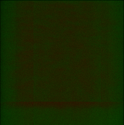
I was curious if certain parts of an Illumina plate have lower quality reads than others. So, I decided to draw a map of an Illumina plate using these coordinates and the average quality score for that read.
In the first image, a white pixel corresponds to the presence of a sequence at a coordinate:

You can see a subtle border between the eight lanes but not much else.
In the second image, I used two colors: Green for average quality scores above 99% (good) and Red for below (bad). This way, approximately half of the clusters are red and half are green.
Second image, in color:

I did this using the Python Image Library and Python. You can see the code on GitHub.